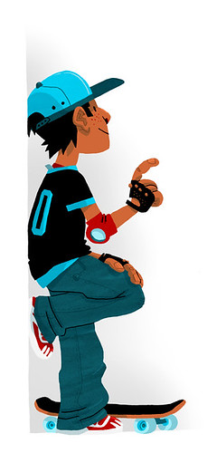
I'm posting more stuff than usual today. The first 2 I finished a while ago. I haven't been drawing quite as much in the last few days, I'm trying to work myself out of a bad mood funk I've been in and out of for a few weeks. Hope you like the artwork and I hope I have some more drawings to post tomorrow.
This was for an article in Thriving Family Magazine about helping your child cope with living in 2 houses with divorced or separated parents. The actual images were further apart with the text in between them on the spread.
I tried to make the 2 homes have some similar colors but feel like they were in different places to show the difference and possible distance. I think I like how the left house turned out a lot more than the right one. Dunno why.
Also for a short article in Thriving Family Magazine. The topic was prayer as a way to support family members over a long distance. Due to my misunderstanding, I originally made the grandmother Caucasian. I was asked to change it and I think the piece came out better because of it.
My favorite part is the patterns I drew on the cloth. I particularly like the mother's blouse.
And here's a sketch with some test color for my ongoing "secret" comic project. I don't have as much experience with creating comics as I do with illustration in general and the progress is slow going. But I'm working with some great friends who not only provide good work and ideas, but very helpful criticism. I'll post more when it's ready. Most of the work is still in penciled/sketch form.
Wednesday, July 28, 2010
Wednesday, July 21, 2010
Tuesday, July 20, 2010
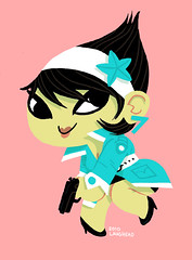
Arale-chan Sketch!
Toriyama is my hero. I always wanted to do my own version of early Dragonball or Doctor Slump (minus the nudity and sex references).
Lately I've been having a hard time doing good artwork. A lot of junky sketches. This sketch was my attempt to get out of the rut and start having fun again. I'm on my way...
Also, I'm bummed because no place in town has the new Scott Pilgrim book and I wasn't smart enough to pre-order. Has anyone found it in Kalamazoo?
Wednesday, July 14, 2010
Back On a Wall
Tuesday, July 13, 2010
Friday, July 09, 2010
Unused Samples
These images are from a potential job. They asked me to do some samples and then either went with a different artist or got rid of the job itself. So, since I liked these samples I thought I would post them. My favorite is how I showed "deep" and "shallow". The top image was supposed to be for the word "cheap", but I don't think it shows it that well. I did like the image though. Do you guys have any ideas on how you would portray "cheap"?
Thursday, July 08, 2010
Yuki 7 Fan Art
I made this last night after staring at the awesome work on www.yuki-7.com for a while. Part of me just wanted to copy what Kevin had done, but I knew I had to "Laughead-ise" it a little.
You can see it on the Yuki 7 site here:
http://www.yuki-7.com/blog.php?itemid=59
and
http://www.yuki-7.com/fanart.php
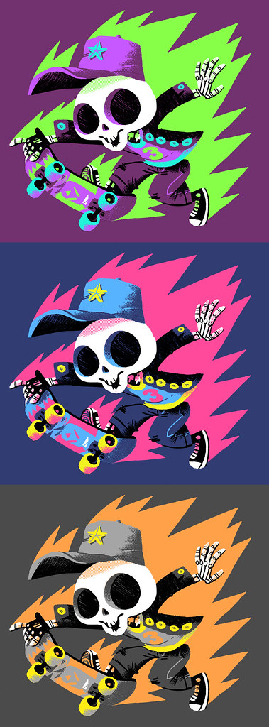
Skeleton Skater 3! Tee Color Options
This is a design I did yesterday that is up for voting on LaFraise: http://en.lafraise.com/Submission/index/id/119663.
My favorite version is the eerie green and purple. That would be a manly purple shirt... right?
I did this in pencil with colors and odd halftone stuff in Photoshop.
Wednesday, July 07, 2010
Tuesday, July 06, 2010
Scott Pilgrim Fan Art
Subscribe to:
Posts (Atom)