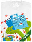
Tricia Aung of StickersAndDonuts.com sent me some questions and I totally answered them. Read it and find out about my secret obsession with: Taco Bell's Meximelt!
Read the interview here:
http://stickersanddonuts.com/2008/09/26/poster-party-day-8-mike-laughead/
Friday, September 26, 2008
Friday, September 19, 2008
Sunday, September 14, 2008
Tyson Schenk will someday have a mustache
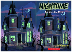
My wife pointed out to me today that I forgot to thank Tyson, my partner in crime, for the critique help he gave me on this cover.
Tyson, I am so sorry. I bet you were "just really T.O.'ed" when you read this last post. I do appreciate your help.
Everyone, you should check out Tyson's new blog:
KeepYourFaceRadical.blogspot.com
He is seriously insane and so are the girls that buy his hoodies at Ruehl.
Friday, September 12, 2008
Nighttime Covers
Doesn't "Nighttime" seem like it should only have one "T" in the middle? Anyway, here are the first two covers for a series of books by Todd Strasser. Each book contains short "spooky" stories meant for the age group a little under the "Goosebumps" group.
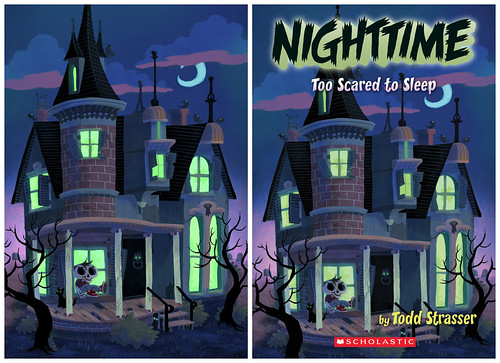
This first cover is supposed to feature the haunted house and the little skeleton kid. He is the mascot of the books. Each cover will feature him in some way. I don't think he is in any of the stories, but he is the thing that unifies all the covers together. Fun fact: The peeling paint texture is from photos of actual peeling paint on my old porch.
Also, I got the main idea for the house from the Henderson Castle in Kalamazoo.
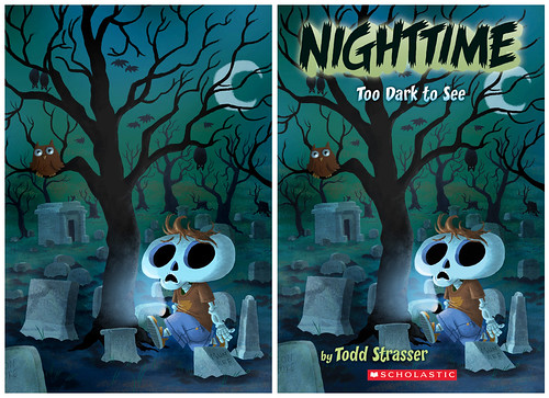
The second cover has the skeleton kid a little scared of being in the graveyard. I'm not sure how visible they are, but I put names on the headstones like "Mumee", "Wolfy Kid", "Boo Boy" and "Mon Store". Also, the texture on the headstones is actual texture from photo reference I took of headstones. (I live right across the street from a graveyard.)
I am currently working on the third cover. I am assuming that as long as Mr. Strasser keeps writing these stories and they keep selling, I will be doing more covers. Just so you know, I was already drawing skeleton children for fun, so these covers are pretty much dream jobs.
I also wanted to thank all of my friends that gave me great critiques on that first cover. You guys helped me to really see what I needed to do to improve things. I would especially like to thank Brandon Dorman who helped me a ton with many critiques. Don't worry, I'll probably ask everyone's help again on this third cover.

This first cover is supposed to feature the haunted house and the little skeleton kid. He is the mascot of the books. Each cover will feature him in some way. I don't think he is in any of the stories, but he is the thing that unifies all the covers together. Fun fact: The peeling paint texture is from photos of actual peeling paint on my old porch.
Also, I got the main idea for the house from the Henderson Castle in Kalamazoo.

The second cover has the skeleton kid a little scared of being in the graveyard. I'm not sure how visible they are, but I put names on the headstones like "Mumee", "Wolfy Kid", "Boo Boy" and "Mon Store". Also, the texture on the headstones is actual texture from photo reference I took of headstones. (I live right across the street from a graveyard.)
I am currently working on the third cover. I am assuming that as long as Mr. Strasser keeps writing these stories and they keep selling, I will be doing more covers. Just so you know, I was already drawing skeleton children for fun, so these covers are pretty much dream jobs.
I also wanted to thank all of my friends that gave me great critiques on that first cover. You guys helped me to really see what I needed to do to improve things. I would especially like to thank Brandon Dorman who helped me a ton with many critiques. Don't worry, I'll probably ask everyone's help again on this third cover.
Monday, September 08, 2008
Halftone Process and Stolen T-shirt Designs...
In response to my recent illustration for The Pitch:
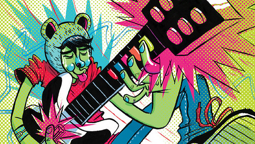
I have been asked what my process is to get the halftone dots. So here is the link to the process:
http://www.mikelaughead.com/HalftoneProcess.html
I hope that helps anyone trying to get the same effect.
Now, I found out about something that kind of drives me crazy. I got an email about a shirt of mine that someone bought in Thailand.

If you haven't seen this before you can check out the Threadless submission here:

So, it never got printed on Threadless, but someone got the image off the internet, made it into a shirt and sold it.
This shirt was also found:

At least this one is going to be printed elsewhere.
I also found a version of this shirt being sold on a site in the Czech Republic:

They were cool and took the design from their site when we told them about it.
So I guess the whole point is, if you want to get a "legal" copy of my shirt from people that have paid me and have high resolution artwork to choose from, follow the links on my site. If instead you would rather get it cheap and easy with some odd colors (that are kind of intriguing), go shopping in Thailand.

I have been asked what my process is to get the halftone dots. So here is the link to the process:
http://www.mikelaughead.com/HalftoneProcess.html
I hope that helps anyone trying to get the same effect.
Now, I found out about something that kind of drives me crazy. I got an email about a shirt of mine that someone bought in Thailand.

If you haven't seen this before you can check out the Threadless submission here:

So, it never got printed on Threadless, but someone got the image off the internet, made it into a shirt and sold it.
This shirt was also found:

At least this one is going to be printed elsewhere.
I also found a version of this shirt being sold on a site in the Czech Republic:

They were cool and took the design from their site when we told them about it.
So I guess the whole point is, if you want to get a "legal" copy of my shirt from people that have paid me and have high resolution artwork to choose from, follow the links on my site. If instead you would rather get it cheap and easy with some odd colors (that are kind of intriguing), go shopping in Thailand.
Thursday, September 04, 2008
So I disappeared for a month...
I had a few people ask me if I died, but that would have been way too emo. Here's what was going on: First, I got a bunch of work, most of which I am displaying here. In addition to the work here I did a couple of book covers for Scholastic. The designer is sending me copies with the title and everything on them so I can display them here. Please be patient. Then, I spent a couple of days chaperoning Boy Scout camp. (Some of you know that I am a Mormon. I have been asked to lead/teach the teenage boys in my ward/congregation. Anyway, that's why I was at camp.) After that I visited my family for my cousin Jimmy's wedding. (Even though I don't drink, it's awesome to order as many Roy Rogers as I want from the bar.) As soon as we came back we had to start preparations to move down the street. We rent from my wife's grandfather and he has a rental house that is one bedroom larger than the house we were in, so we decided to move into the bigger one. The new place needed a lot of painting, cleaning and fixing (thanks Thompsons, Devin and my awesome family.) So we had that plus the packing, moving and cleaning up of the old place. So now we are moved into the new place. My office is still full of boxes but the extra space is way better already.
So, here are the things I worked on:

Spot for Good Housekeeping. The article is about which
technological gadgets are appropriate for children as they grow up.
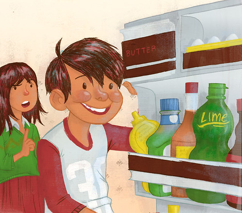
This is a small illustration for The Friend magazine.

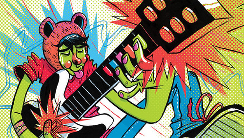
For the "events" section of The Pitch. I really liked messing around with the halftone dots. I'm not sure which color scheme was actually printed.

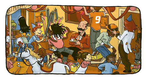
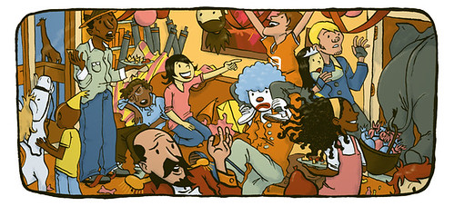
Panels from a story for Nelson Education. The story is supposed to be totally over the top and this part covers much of the chaos.

For an article in Insight magazine about the dietary practices of 7th Day Adventists (Insight is an Adventist magazine for teens).
I can't wait to show the book covers. Thanks to some great critiques from friends and family, I think they turned out really great. I am working on the third one right now.
So, here are the things I worked on:

Spot for Good Housekeeping. The article is about which
technological gadgets are appropriate for children as they grow up.

This is a small illustration for The Friend magazine.


For the "events" section of The Pitch. I really liked messing around with the halftone dots. I'm not sure which color scheme was actually printed.


Panels from a story for Nelson Education. The story is supposed to be totally over the top and this part covers much of the chaos.

For an article in Insight magazine about the dietary practices of 7th Day Adventists (Insight is an Adventist magazine for teens).
I can't wait to show the book covers. Thanks to some great critiques from friends and family, I think they turned out really great. I am working on the third one right now.
Subscribe to:
Comments (Atom)

