Wednesday, April 30, 2008

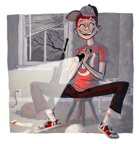
Smiley Kid w/ a Flashlight

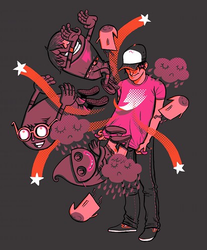
Smiley Kid
I was just messing around with this. I used a few textures for it. One was a scan of some old paper and the other was a photo of a screen on a window (for the wallpaper stuff.) My wife says that she is creeped out by his smile and the gun. I guess there is some implied craziness/menace there. I think it gives it more character.

I also wanted to thank everyone for the printing suggestions. I am looking into it.

Any pieces that you would be interested in buying?

Tuesday, April 29, 2008

Good place for printing Artwork?

I have had a few requests for art prints lately. Does anybody that reads this know a good (relatively cheap) place that does prints? The best would be a place that works like cafe-press, (print per order) but is a bit higher quality. Any help would be much appreciated. Thank you.

Friday, April 25, 2008

The Pitch KISSes and kicks my butt. Also SkullBoy

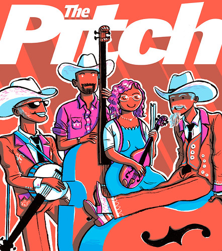
So here are two images I did for "The Pitch" (a newspaper in KC if you didn't know.)
KISS "The Pitch"
This first one was the header to a calendar thing. One of the events was a KISS convention. I only have two regrets here, not taking the time to make them "shiny" and not putting Gene Simmons' tongue out. I do like his pigtail though.

Wilder Pitch Cover (Unused)
This second one was a cover idea that didn't end up working. I think a big part of the problem was the crazy orange color that evidently looked like puke when printed on newsprint. I hope to do another cover sometime in the future.


This last image is a Tee shirt design I'm working on. You can check out a few color variations here. You can also comment if you see any ways I can improve it.

Monday, April 14, 2008

Magical Threadless tee and Shakespeare's donkey

My Magical Tee
This is my newest Threadless submission. I'm trying out mixing my cartoony stuff with more "realistic" people. Plus I inked this one and kept most of the lines. I'm very happy with the result. Please click below, then comment and vote on it.
My Magical Tee - Threadless, Best T-shirts Ever
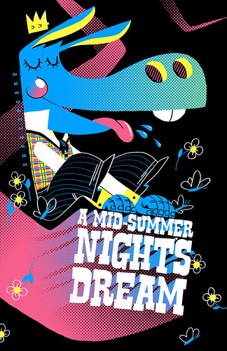
Mid-Summer Nights Dream Poster
I assigned my digital painting class to do a Shakespeare play poster and I decided to do the assignment with them. I just went with the CMYK colors so this could be a 4 color print + the white or black of the paper (it would look better on black.) To view my class blog with links to the student's class blogs click here.

I also found out that an image of mine was used as reference on a German language blog. The article is about some artists sharing their process with others and some keeping it secret. Here is the blog: Computerlove
If you want to check out the tutorial that the image is from click here.

Friday, April 04, 2008

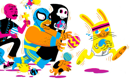
Easter "Pitch" Calendar Header

Easter Pitch Calendar Header
Here's a piece I did for an Easter calendar thing for "The Pitch". I stuck with CMYK and Orange. Super fun and I was given free reign to do what I wanted. Zach Trover is an awesome art director.

Tuesday, April 01, 2008

Jock Style

Jock Style
I'm still working on making my style more adult. I'm liking some of the stuff I am doing.