Monday, March 31, 2008

Illustration Work, Mojis, a (Somewhat) New Style and Inks

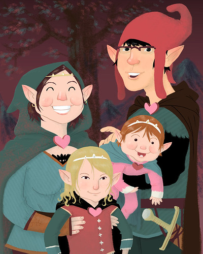
I've been saving these first two for a while. I'm not sure why. I do a family portrait every year for Valentines Day. This was my first year drawing our baby Penelope. I rally like the style but I made myself a little too tall for the composition. The second is a poster for use in classrooms. The kids are supposed to discuss what each person is doing. They were very specific about the race, clothes, gender and action of each person. I even had to make the teacher look less "womanly". It was interesting and fun. I should have some more illustrations for "The Pitch" up soon. Whenever they get printed. Everything else was pretty much just fun stuff to draw.

Family Portrait 2008
I made my family elves this year. Mostly because my older daughter Eva looks like a tricky little elf.
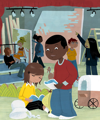
Educational Poster
I added some depth with the characters in the background being in shadow. I really like how the depth turned out. It was hard to get all of the figures doing what they were doing for this assignment.
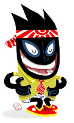
Mr. Tooty Pants
Some guy I made up. I think he's kind of funny.
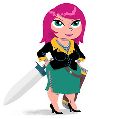
Sword Woman
Just a little character I made.
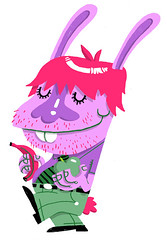
McRabbiton
Some weird dude. I don't think he's very smart.
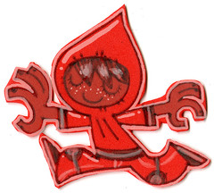
Foamy Boy
I drew with a pen on some foamy stuff my wife bought. Then I cut it out with safety scissors. The white was added digitally.
Ice Cold
I'm doing a few practice illustrations with characters more "adult" in proportion. I still make the heads a little too big.
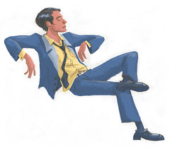
No Chair
New "adult-ish" style. I'm just messing around.
Inkling 02
Just realizing that I like inking and I can go a little more realistic in my style.
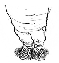
Inkling 01
I'm pretty proud of how those feet look. I know that the foreshortening is a little odd.

Friday, March 07, 2008

Old Design, New Threadless submission...

MC Boom Box - Threadless, Best T-shirts Ever

Please check it out, vote and comment, love it, kiss it and stuff.

I think I'm starting to favor the green w/ pink stars color option the best.

Monday, March 03, 2008

2 Oldies and an Elephant

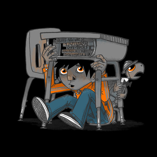
Shadows Rework
I just re-worked an image in my portfolio from a couple of years ago. I'm really liking the limited use of color on this a lot.

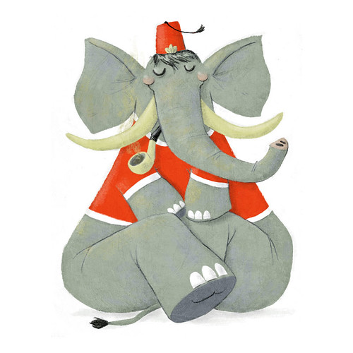
Elephant Fez Spot
I was trying for a fuzzier/chalkier style with this one. I want to thank Tony Carpenter for the texture.

I liked doing this, but I'm not sure that I want my style to go this way.

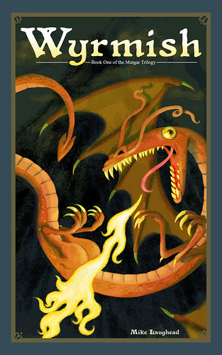
Wyrmish Cover
This is a re-work of an old dragon image from school. I made it into a book cover because that is what it's original intent was. This ended up being in a style similar to the elephant. I'm not sure how much I like working this way.