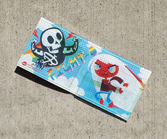
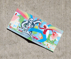
This is my first wallet for TinyMeat.
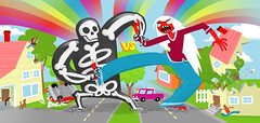
I did this with Zach Trover. He designed the skell-o guy and I did the white haired lady. Then I illustrated the outside and he illustrated the inside. So we each did a take on each other's characters.
Here is the outside:
And the inside by Zach:
And for the interested here is the digital version:
I'll tell everyone when it goes on sale.
Thursday, September 27, 2007
Tuesday, September 25, 2007
Saturday, September 22, 2007
Final BYU-Idaho cover and odds and ends...
This is the last cover for the BYU-Idaho Performing Arts magazine. The school splits the year into Summer, Fall and Winter "semesters" (I know that Spring would be normal but the weather there makes Winter a much more fitting name.)
I tried to bring back some of the colors of the first two into this one, especially because the ground isn't green like in the other two.
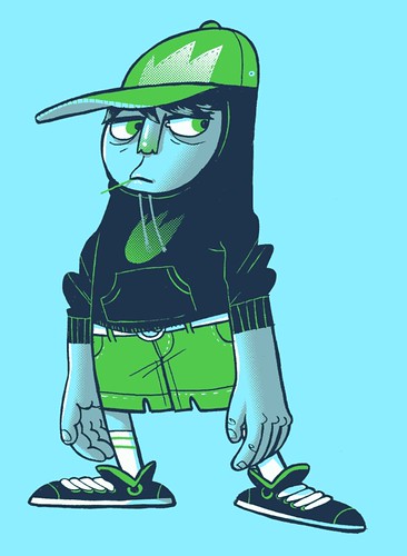
I was trying to go back to using more lines and mess with limited color and the halftone screen stuff. This one is 4 colors. I added a longboard for him and submitted it to Threadless. Also check him out on Mojizu.com.
I animated the eyes for the Threadless thumbnail. I thought I would show it off.
This is more messing with halftone screens and limited color. I only used 2 colors on this. (I'm working out how to do more interesting stuff for band posters.)
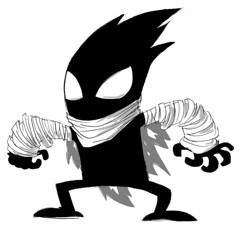
I did a drawing of Phil Hester's "The Wretch" character.
I've been thinking/working on my story "Doctor FizzyBanks" as a children's book. I'm hoping that the children's book format would allow for more detailed and interesting illustrations. I'll post more as I work on the style that I want for the book.
Wednesday, September 19, 2007
A Threadless idea from Dave...
Monday, September 10, 2007
Comic Convention, Ultimate Frisbear and some photos
This is an illustration for the free Kansas City newspaper "The Pitch". It is a little promo for a comic convention that is mentioned in the paper. I think that they are all identifiable characters except for the cat eared chick (I wanted one character that I could make whatever color in order to create a more balanced illustration.)
I did this semi-caricature of my brother-in-law for his birthday. I've always told him that he looks like a koala, yet he has a large amount of curly blond hair. I wanted the "uniform line width" that you get in illustrator, so I used it to make this one. It was fun working in illustrator again and it also helped me to remember why I switched to photoshop.
This is a picture that my wife took of my friend Tyson and me when we went to Ohio to visit him. Tyson works on the women's line of Ruehl which is one of the Abercrombie & Fitch companies (like Hollister.) This picture was taken on the actual Abercrombie campus. They have those little scooters sitting around for anyone to use to get from building to building.
Funny things about this picture, Tyson's glasses and his shirt (that thing is crazy). Not so funny things, I look like I have a gut (which some claim I do.)
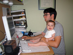
I recently moved my computer to my drawing table in order to have my entire workplace in one room. Though it is more cluttered it allows me to focus on my work much better. Also, my daughter Penelope is adorable.
Subscribe to:
Posts (Atom)