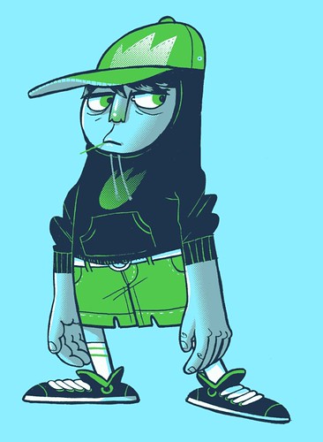
This is the last cover for the BYU-Idaho Performing Arts magazine. The school splits the year into Summer, Fall and Winter "semesters" (I know that Spring would be normal but the weather there makes Winter a much more fitting name.)
I tried to bring back some of the colors of the first two into this one, especially because the ground isn't green like in the other two.

I was trying to go back to using more lines and mess with limited color and the halftone screen stuff. This one is 4 colors. I added a longboard for him and submitted it to Threadless. Also check him out on Mojizu.com.

I animated the eyes for the Threadless thumbnail. I thought I would show it off.

This is more messing with halftone screens and limited color. I only used 2 colors on this. (I'm working out how to do more interesting stuff for band posters.)

I did a drawing of Phil Hester's "The Wretch" character.

I've been thinking/working on my story "Doctor FizzyBanks" as a children's book. I'm hoping that the children's book format would allow for more detailed and interesting illustrations. I'll post more as I work on the style that I want for the book.

8 comments:
I really love your work, amazing!!!
I am a fan of these illustrations. I really like the characters you have been creating lately. I also think the half tone screens are working very well.
I can't wait to see Doctor FizzyBanks as a picture book.
I really like the dancers. The action is very accurate. Did you call upon your years of ballet training for this?
Great designs all around! The halftone screen effect works great for that kid.
Love it Mike! I'm sure my comments aren't very constructive, but your work is sweeeeeet! I especially love your "Wretch," plus I've loved seeing your work for the BYU-Idaho stuff. I saw one in print, it rocked!
Hey! Awesome stuff.
I really dug your post about your process. I'd love to see a little tutorial on the half-tone effect, or at least some tips!
Great work. Keep it up!
what a post! all of these illos are so great, mike!
I just have to say that I LOVE all three of the Insight covers. Such fun characters, shapes and colors. They make such a great set. Nice work!
Post a Comment