After finding the old process sketches and work on this illustration, I thought I should show and explain how I went about producing it.
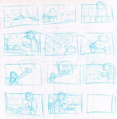
The job was to illustrate Record Day, so I basically had to have a record shop. I like drawing people (and monsters) so I planned on putting a person in a shop and trying to make it look sweet. As you can see I got the final idea early on and did some different variations on it.
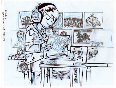
During the thumbnail process I drew this sketch. It sucked. So I kept going with the other thumbnails.
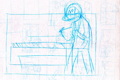
After I settled on a composition, I messed around a little drawing the character. If this was going to be a series of images, I probably would have done many more of these to work the character design out. If you notice, I tried a guy and a girl, but settled on the guy (I don't remember why.)
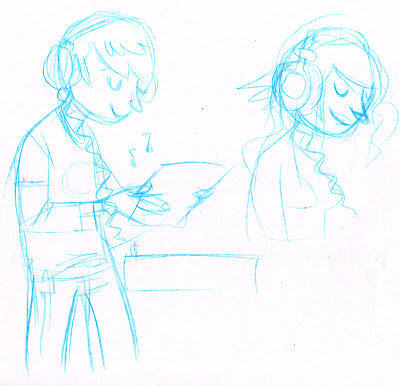
So I started the sketch. As you can see I draw in blue line first. I was working out which album covers would go where in the composition. Once I did the whole thing in blue, I used a mechanical pencil to draw darker lines. I did this to chose which lines I want to use and to make it easier to trace.
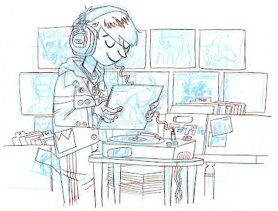
With blue pencil again, I traced the drawing and did a more refined version on another sheet of paper (I use regular computer printer paper). Then with a brush and ink, I inked all the big lines. After that, I used the mechanical pencil again to draw the small little detail lines. Because of the album covers this illustration had more little details than I often do.
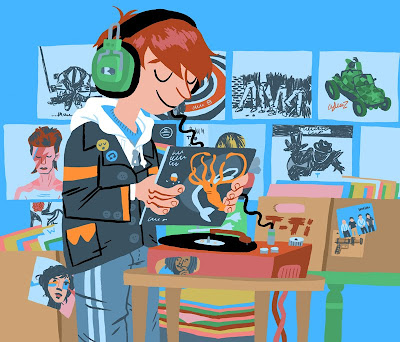
Next I scanned the inked drawing into the computer. I took away the blue lines and colored everything. All of my lines are still there, I just colored a lot of them to blend in with the color of it's shape as well.
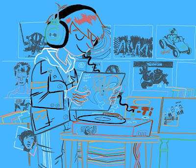
Here are the lines without the shapes filled in. I like working this way because I'm using the ink drawing I did, so the edges of my shapes and lines have a hand-drawn feel, but I can also spend time adjusting the colors of the lines and what lines I keep or take out.
Next I added some shadows. Some of my illustrations have a lot of shadow, but this mostly was under the guy's chin and on the legs of the table.
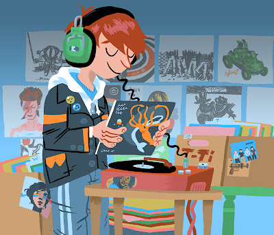
At this point I thought that the back wall was popping out too much and I wanted to bring focus onto the guy, so I lightened the color of the wall and added a grayish gradient behind him. I wanted to make the wall a duller color than the guy holding the record.
This is the final drawing cropped the for the paper. I had always planned on cropping it like this which is why I never finished the drawing of the Ramones or Rancid album.
I hope this has been instructive and/or interesting. If you have any questions just shoot me an email.