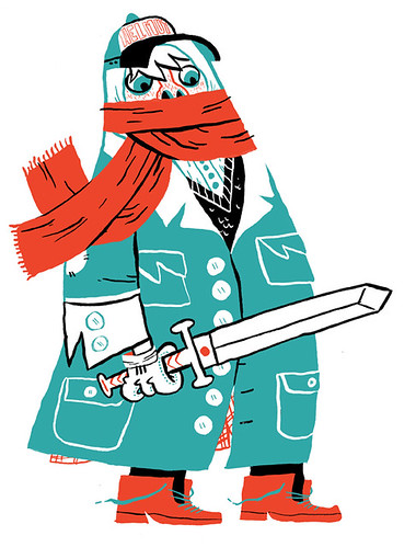
This is a sketch/style that I want for a new poster I am doing with my brother-in-law. My wife says that the guy is too creepy and I need to put cute vampire children. Doesn't sound like too bad of an idea to me. If you have any suggestions for poster ideas, just comment here or send me an email.

Spot for Insight Magazine. It's supposed to be an easily identified Australian, hence, Crocodile Dundee.

Also for Insight. A little story about steroids.

I did this logo for MikeTysonDesign.com. We sell our (as of right now 2) posters from there.

4 comments:
i dig the 'roids piece and the "easily identified Australian". And the other new pieces.
that top sketch is awesome, mike. i love that type of style from you. your last poster design too.
Yup, I love the scar guy/style.
Flat color, nice and clean...along with your signature silhoettes and color choice.
It's all good.
I liked the MT logo too. You rock. :)
Yo, great Mike.
That plain illo is so cool.
love the composition.
all the best,
R
Post a Comment