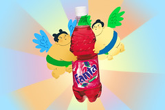
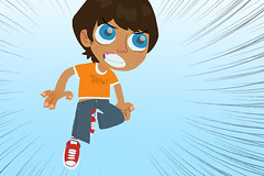
Also, here are some boards that I did for some motion design stuff. It is actually for their show reel, they are putting together a portfolio and wanted different kinds of stuff in it. So they hired me to put some stuff together for them. I hope you like.


The little animation for my user-pic was used from this kid. It was kind of fun to put together a little animation. (It also made me realize that doing animation kinda sucks.)

3 comments:
Could you elaborate on this fanta stuff? I don't know what it's all about.
I've seen quite a bit of your artwork before and you like to put awkward nipples on fat men and fat creatures. I know that you spent some time on the beaches of California as a child; did you see something there that has made this a feature of your permanent artwork?
And to answer Kathy's question: these illustrations were sample storyboards for some company and fanta was the chosen advertising product. At least that's what I understood.
that video was ALGEBRAIC!!!thanks for sharing such awesomeness, mike.
Post a Comment