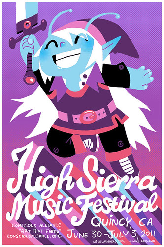
Poster for the High Sierra Music Festival. Copies will be available at the festival. After I finished this I realized that this is what comes from too much Zelda, Star Trek and Dragonball.
I enjoyed the process of this one, so I thought I would show my steps.
1. I started with a bunch of sketches. I did a lot more sketching than this, but I just wanted to show my favorites. I really liked the tiger idea it was just getting to busy.
2. After scanning the sketch above, I added the type and printed it out large. After printing it out I traced/redrew it all to get the details the way I wanted. This drawing was done in graphite.
3. These are my initial colors. I used to read the Drizzt books when I was a kid, so I wanted to make him a dark elf. (I'm also a huge fan of the show Community, check it out!)
4. Realizing the dark elf thing wasn't working, I kept adjusting colors. I've really become a fan of purples that edge towards pink and red and they seemed to be working for this piece.
5. I kept adding little details and adjustments including some halftone dot gradients. I also added the information for the show. I think I'm in love with my own hand-drawn type and I don't really know why.
6. Here is the final poster. I thought that the spaces on the side of and above the alien-ish guy felt empty, so I added the long hair and the antennae. Strangely, these things make the character look less like a Link ripoff and more like a mix between Link, these guys from the old Star Trek and this guy from Dragonball. So am I a hack who just rips off ideas, or a super-genius for combining 3 separate things that have nothing to do with each other? You must decide!
As a bonus, I thought I would show how my 2 daughters colored my drawing for this poster. I often leave my drawings on my desk and both of my daughters on occasion have colored them. Luckily, I have usually scanned them by that time.


